Fida Gateaux Pristige
Project Introduction
Fida Gateaux Pristige is a renowned establishment dedicated to crafting some of the finest sweets. With a focus on creating memorable and delightful confections, Fida has become a popular destination for those seeking high-quality desserts.
Project Description

Letter “f” and Cake Shape
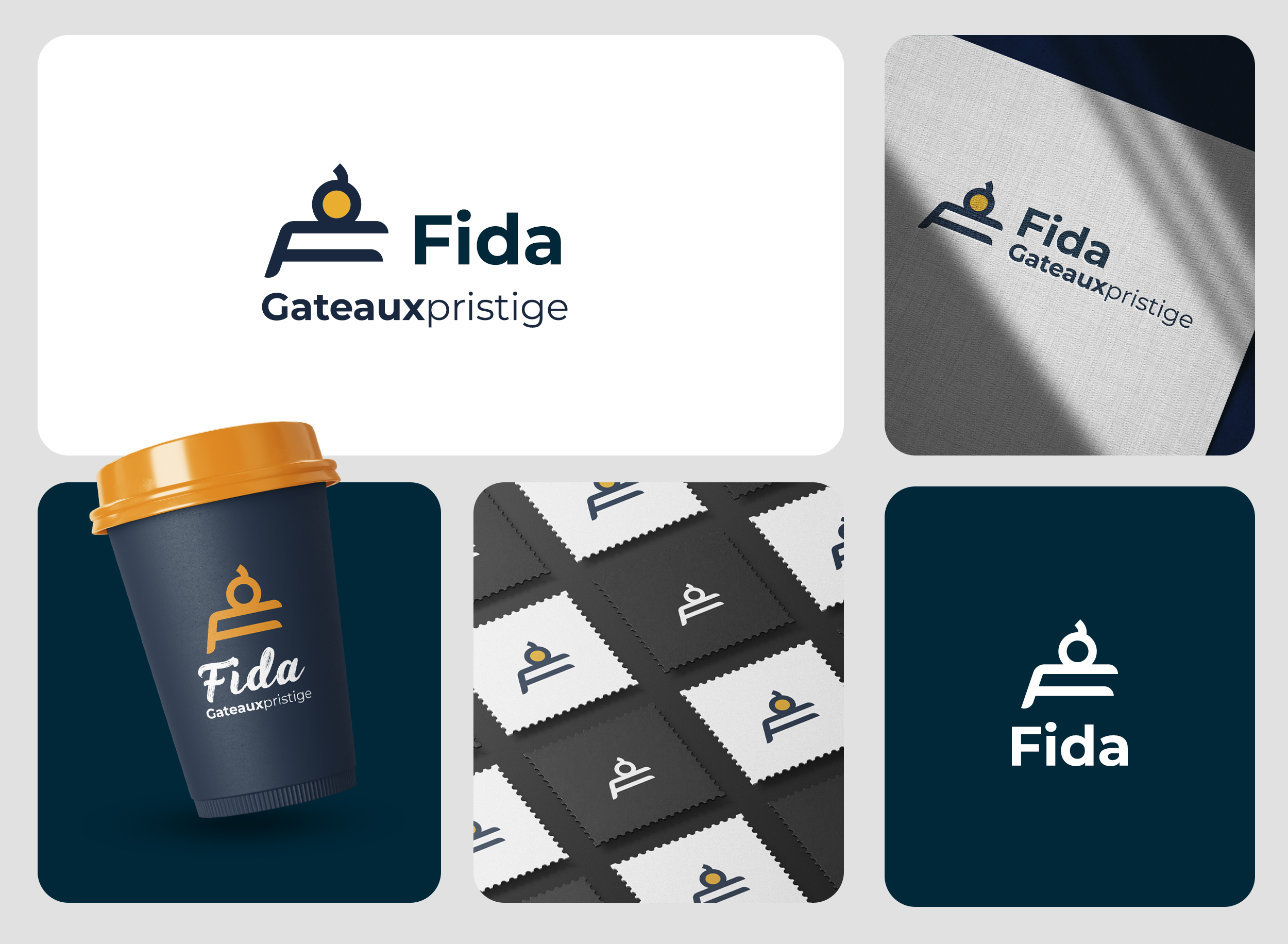
The logo cleverly integrates the letter “f” with the shape of a cake. The design includes a stylized “f” that flows seamlessly into the form of a cake, symbolizing Fida’s expertise in confectionery. The cake shape is depicted with smooth, rounded lines, adding a playful and inviting touch.
Color Scheme
The primary colors used in the logo are dark blue and bright yellow. The dark blue conveys a sense of reliability, trust, and professionalism, while the bright yellow adds warmth, joy, and creativity, reflecting the delightful nature of Fida’s products.
Typography
The logo focuses solely on the icon, with the stylized “f” and cake shape forming a strong and recognizable symbol. The absence of additional text ensures simplicity and memorability.
Design Layout
The layout of the logo is clean and balanced. The combination of the letter “f” and the cake shape creates a harmonious and visually appealing design. The circular element at the top, resembling a cake decoration, adds a finishing touch to the overall look.